Gowalla 4.0
September 23, 2011
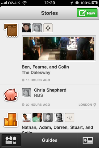
Off the back of my original post about Gowalla, the team there have now released an updated version of the app and it’s absolutely beautiful to look at!
The update is stunning from a design perspective especially that loading animation when refreshing your lists, however I do feel the app itself has taken a direction I’m not thoroughly fond of….
After finally getting in to the previous version of the app, this update seems to confuse me, theres no information on ways to access things you’re used to using when you first open the completely redesigned app (it took me long enough to figure out how to add a spot) and making Guides the focus of the app seems silly when I live somewhere where there isn’t going to be any decent guides.
The large check in button of the past is gone and now to check in somewhere you need to first search for a spot instead of it showing nearby locations by default and find it via the results.

See that new button? that’s how you’re supposed to check in now…
The default list of spots ‘nearby’ seems to show the most checked in places in that city at the top of your list such as stadiums and cinema’s (even if they are ten miles away from your current location – dumb) before searching for your local restaurant or bar.
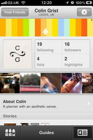
Settings and stamps seem really hidden too, I miss stamps, they are the reason people loved the design of Gowalla over other rival check-in apps such as Four Square before, those cute little stamps/pins you get for venturing somewhere new, now they are hidden away – seems a real shame.

Your stamps are another two clicks away from here, Nice loader though!
They’ve also removed plenty of things (such as items, which have just been completely deleted from the app) and added new bugs in this version, such as double posts when you now check in make a new story (seems silly) and the app still crashes, which definitely needs ironing out.
So Gowalla seem to be trying to change what they are about, and making it more of a guide for tourism, but that isn’t what the app was about or why anyway got in to the app in the first place, it feels like two steps forward on the design front and three steps backward for users.
Can we get the old app back somehow people?