Redesign
January 9, 2010
Hey all, welcome to the latest version of my personal website, I have to openly admit that I do change my website too often, but i’m sure i’m not the only one out there who gets bored very easily, especially if you’re of a creative mind.
Anyway, I decided to do-away with my old design and revert back to using WordPress! WordPress is something i’ve used in small doses over the last few years but, I’ve decided to use it full-time from now on, as not only is it a great blogging platform, but it gives me the ability to just be able to update things on here either from my laptop, iPod, whatever, so I don’t always have to be locked away in my office anymore for updates!
Regarding my new logo, i’ve never had what i’d call an “official brand” – it’s never really bothered me either, but I thought i’d atleast make a bit of an effort this time around.
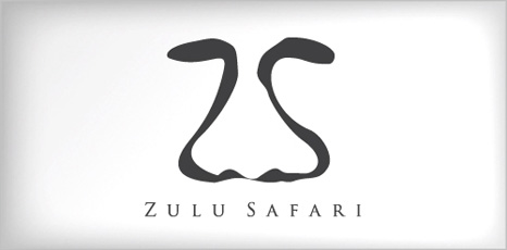
I really wanted to incorporate my initials of CG into the logo as they go quite well together but nothing’s ever worked right in the past, with that in mind and also recently being shown a fantastic piece of logo design which, a fellow designer pointed out to me by Graham Smith for his client ‘Zulu Safari’ I started work on what you now see above.
The initials C and G use the typeface ‘Alba’, a font i’ve used before on my old logo which, simply stated ‘col’ in lowercase, it’s a real nice font and this time the G really caught my eye. Once i’d got the C and G together, I simply tweaked the distances and rotated the G in illustrator to pull the bottom half of the G inwards to make almost a triangle shape, then when I looked at it for a minute, I thought to myself – “That looks a bit like a nose and a pair of eyes!”.
I then simply added a smile to the bottom, originally I had a rounded smile to match the rounded C and G but it also looked a little too much and so I went with flat edges instead, I felt it really finished off the mark. I did then attempt to insert the domain name into the ‘mouth’ section of the logo, and to almost make them look like teeth, but that too was just a bit much, and also didn’t really work when the logo was made smaller.
Anyway, I hope you like the new website, personally I think it needed the overhaul, and i’m glad updatings as easy as logging into WordPress once again! Hopefully you will sign up and keep track of all my upcoming posts!
